It’s my WebWatching Wednesday again, and these five reader blogs caught my eyes:
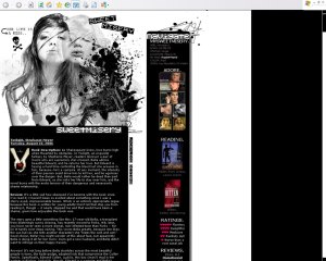
Vexing Lit Vixen Amarjaa
Amarjaa’s blog design makes black and white look really cool and funky. She has a healthy respect for white space and contrast. I was quite fascinated by the way the striked-out text links unfolds into two double lines when you mouse over. I also like her selection of songs, but some scripting error prevented me from listening to Maroon 5. Who would have thought black and white could look so sexy?
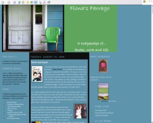
The blog banner was what caught my eye. The image is simple yet evocative. It makes me dream of happy days sitting out on the porch of a country home reading — some day when I retire from the world. I also like the font Fiona uses, it’s so carefree yet feminine … hmmm wonder if it’s Lucida or Bradley Hand.
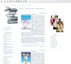
I’ve always been a sucker for clean, neat lay-out so naturally PBR’s deisgn design caught my eyes. TartGraphics, whose design this is, made creative use of white space and faint blue lines to set the tone and voice of the blog and gave this site a no-nonsense look and feel of a book reviewer who’s ‘honest, unflinching ad unapologetic’. Very fitting indeed.
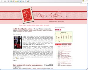
First things first, I wish to congratulate the two Jaynes for coming up with this refreshing and clever concept of book reviews in the form of a letter to the author. I’m not smart enough to think of that, so hey they deserve our applause. Next, I love how they’ve made their site easy on the eye with adjustable font size, and I’m thrilled they’re featured on Blog of the Day. The postage stamp is the cherry on the icing, ties in very nicely with their blog title and the domain — marvelous for online marketing. Great branding.
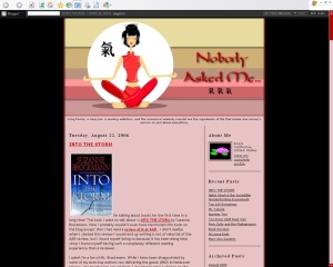
I have Kristie to thank for helping me to discover Rosie. I just love the way she’s woven the Asian girl in a zen pose, the lotus avatar, the rose red/pink hues (Asian colours) and the Chinese character ‘qi’ which means energy flow into a very coherent theme. Gemmak Design did a wonderful job with this. This is another striking blog set into a black background.

Wow, thanks for stopping by. I love the look as well. GemmaK rocks. I’m so glad I got the opportunity to work with her before she took a break from web design. It’s made a world of difference for me to have my blog feel more like it’s my own.
I really like the black and white theme. A lot of designers tend to be very heavy handed with the black, but thisone you chose has got the balance just right. Great taste!
Oh my goodness! Thanks, AG! 🙂 I can’t take full credit for the actual coloring and design (that’s by jackylegs), but I *did* spend a week of my life sifting through createblog.com’s layouts to find this baby. Which I think counts for something! 😉